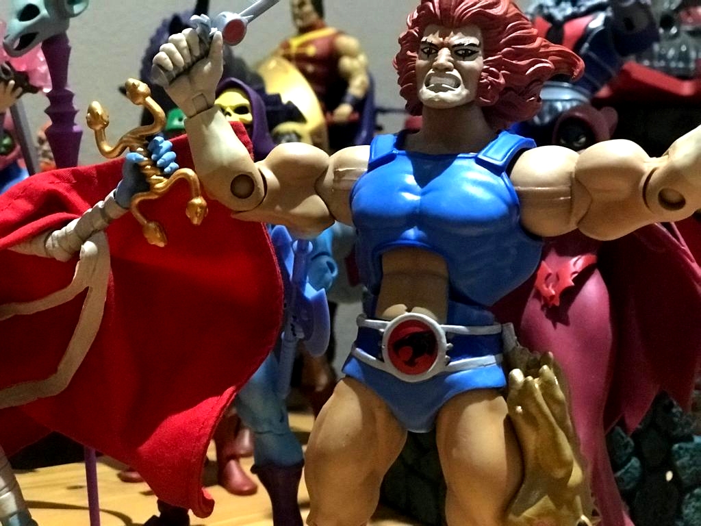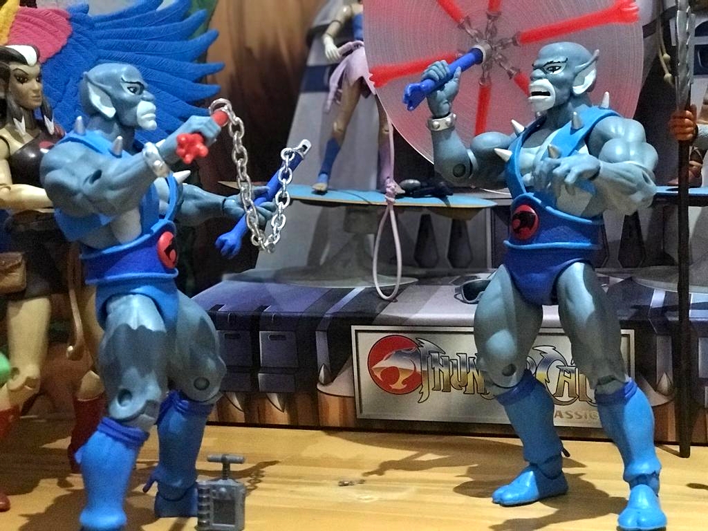

It’s been a good 3 – 4 months now since the Wave 1 ThunderCats ULTIMATES! figures shipped worldwide. Now that we’ve had some time to live with these figures, I thought I’d get my thoughts together and give my 2 cents worth on this new iteration of the figures previously released by Mattel, albeit now in a more extravagant offering. We’ve gone from “ThunderCats Classic” to “ThunderCats ULTIMATES!” so there is a lot to be excited about.
First up – there’s a big difference in terms of the packaging. When I first saw that original red mock up I was a tad discouraged. Look I never disliked the Mattel packaging but I never loved it. It was ok. But in comparison to the MOTU Club Grayskull packaging, it was a little bit of a let down. I thought with that style of packaging created, that Mattel could’ve done something more creative similar to that. It was not to be. Still, I liked the fact that it could slip out of the packaging without damaging it. Super7 took it up another notch. Or two. Or three. When they revealed the modified black and red version of the packaging, I was excited. It worked. Those white spotted background was so typical vintage LJN. Seeing the flip side though is what gets me every time. That artwork! Man!! It’s magical. I still have my old puzzle from 86. I’ve lost some pieces, but it is still hanging in my office today. Can’t go wrong with that one.
It’s obvious therefore that the packaging surely blew me away. It was so thinnnn. I was expecting a very bulky box like with TMNT ULTIMATES!, but even though ToyBro showed them off side by side, I didn’t expect them to be soooo thin. In fact, when the courier company that imported these for me gave me the measurements, I was super worried – I thought I’d gotten only half of the figures. But the sleek box design works for me. The trays inside works just as well. I would’ve hoped to have the boxes in plastic sleeves like with TMNT ULTIMATES!, to protect them from friction, especially on the foil. Since I’m not a MIB collector, I don’t mind that there are parts that will be replaced with updated ones.
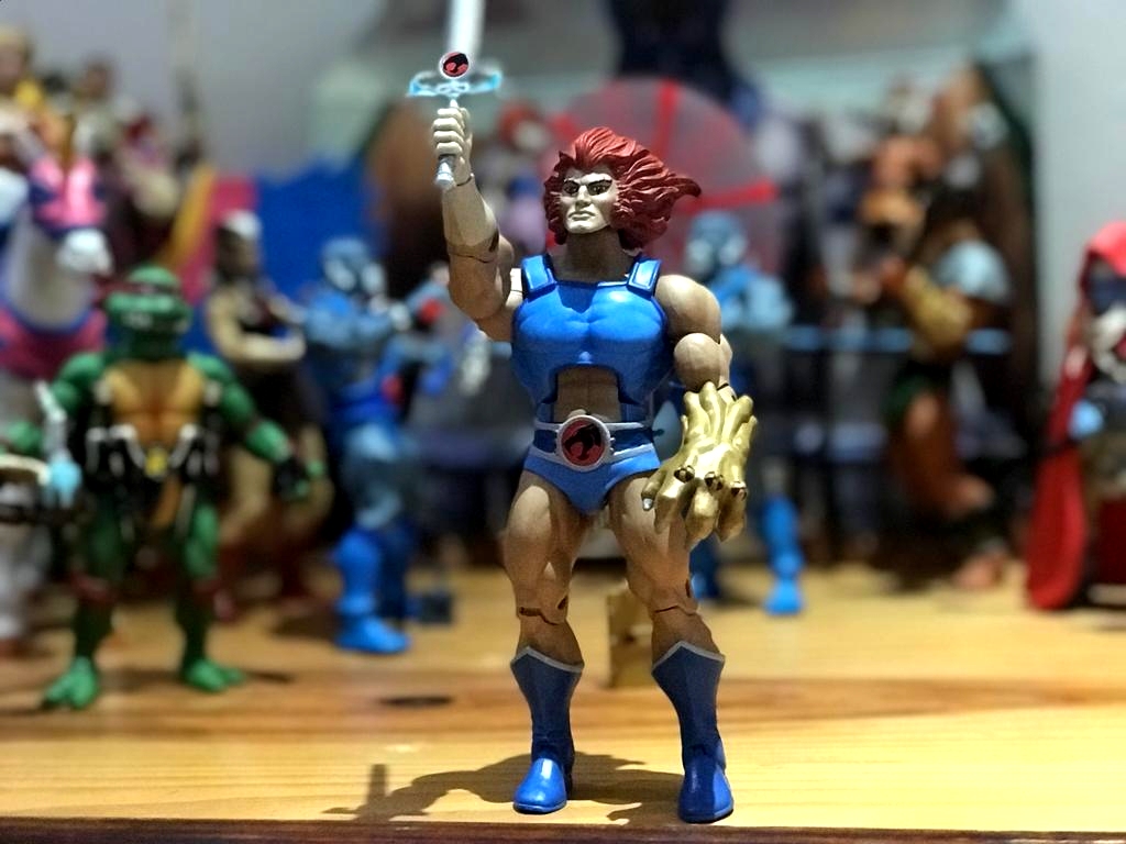
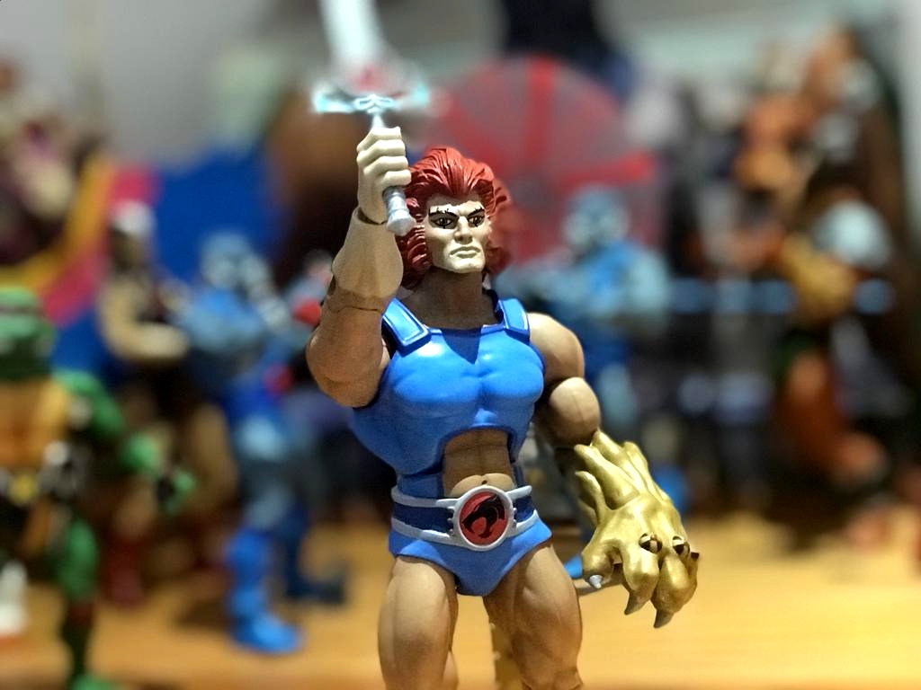
To me my biggest worry of the whole wave was not the light blue pants on Panthro, but Lion-O’s face. Not living in the US makes it difficult when you order items like these; especially if there are factory flaws to be expected. Returning them costs lots of money, and it is sometimes not worth it. So I went straight for Lion-O and was thrilled to see his face paint was fantastic. It was sorry to see that some other collectors had wonky eyes or chins that looked like 2 day old beards. Once that fear was gone, I got to enjoy seeing them displayed. Although I have the Mattel ones, I had to get these guys for the accessories. Yea I’m that kind of collector! Still, the second heads really worked well for me. I could create four new characters with my existing figures. I think Mumm-Ra and Lion-O surprised me the most. Jackalman and Panthro had the errors we knew up front about, so I wasn’t upset about that. They still looked great to me.
When comparing these to the originals from Mattel, I like the colors more. They’re more vivid. I don’t know why they just stand out more. I loved my Mattel figures, but the colors on these guys just pop more. They feel a bit sturdier in hand to me – the articulation is stiffer. The heads pop on harder. The plastic quality is the same so I can’t complain about that. That was one of many collectors’ worry. Super7 certainly got the quality right here. The same with their TMNT ULTIMATES!. I got those a few weeks before getting these and that already had me at ease. Ok fine, I was at ease long ago already as it didn’t bother me before, but there were slight differences when comparing to the earlier MOTUC stuff by Super7 and if people wanted it to match Mattel’s plastic, this certainly was achieved.
For obvious reasons the OCD in me kicks in when it comes to the light blue pants on Panthro. Look, it really doesn’t bug me, but I notice it when I look for it. Luckily those are being addressed. We’ll be getting the replacement parts soon. I’ll decide eventually if I want to replace his pants since I’m not a customizer. (UPDATE 23 August 2022 – I finally did it after much deliberation and it came out brilliantly!)
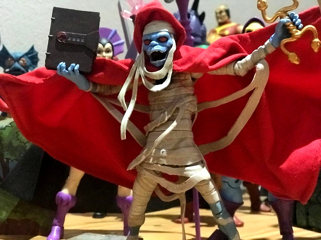
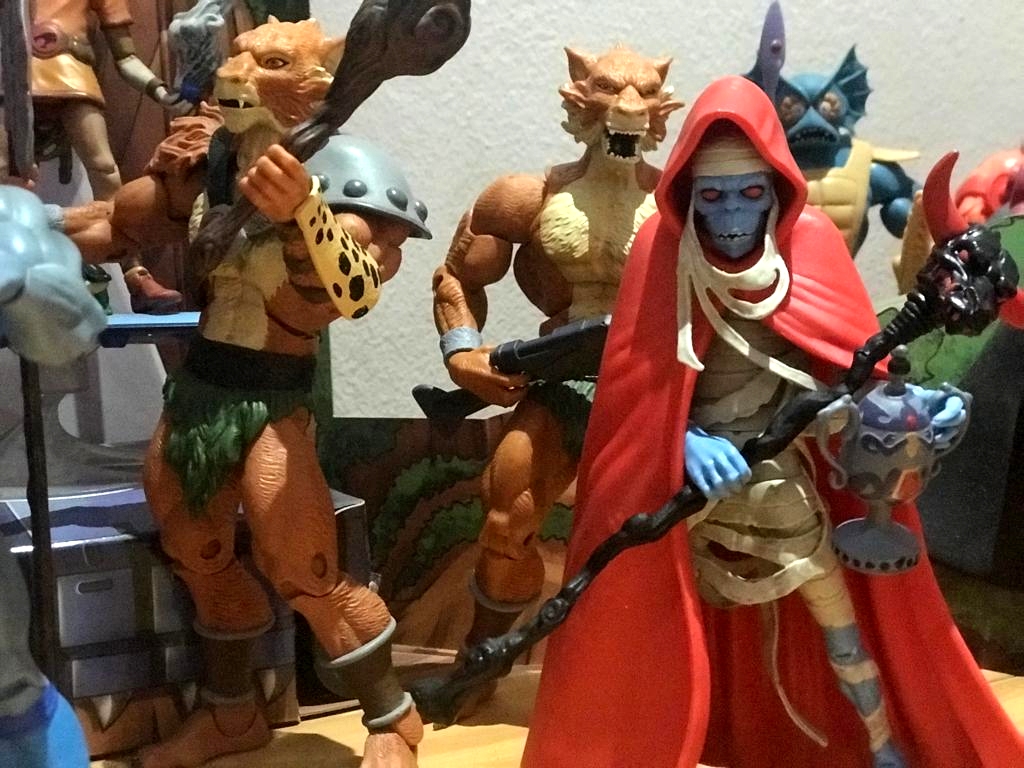
I saw someone comparing Jackalman’s version and he pointed out that piece on his stomach that is painted has a straight line on Super7’s version, while Mattel’s has it edged out, smoothed in. I never noticed it (just shows you!). But I do prefer that on the Mattel one. There’s isn’t much really that’s different to me. I’m displaying both. Most of the Mattel bodies are my new characters – Lion-Faux from that ThunderCubs episode has the angry face, Panthrfaux is the Spitting Image one with that extra head (ok I’ll stop now with the faux’s), and the gnarly Jackalman is actually used with the Super7 one, while keeping the Mattel one as the main character but using the Super7 head here. The Mattel Mumm-Ra is hidden in the bright let plastic cape and the new one is wearing the cloth cape. Man that cape is really impressive. I dig it. I didn’t think I would. But there again Super7 surprised me. Another thing I want to add that folk might expect to see here, is the Key of Thundera. I heard a lot of people say that it is missing that rope piece that the Mattel one had on. Well – here’s a quick fact check for the naysayers! The key appeared as BOTH versions in the cartoon. When it was first introduced and shown off by Panthro it had it on. When it showed up in the very last episode, it was “ropeless”. And yes I have noticed that the symbol was printed on wrong. That’s a bummer indeed. Still, the key appeared as both versions in the toon.
Let’s talk about the production figure vs the prototype. I’ve had lots of people asking why do I continue to use the original prototype photos of the characters when the production figure is SOOOOO different. I don’t get it. It’s not so different to me? Maybe I’m just daft and don’t see that. Sure, the pegs on the arms were missing this time round. I never noticed it until it was pointed out. The reason this happened was already addressed by Brian Flynn in my last interview about Wave 1. Will it be so different with the future figures who won’t have it? I don’t know. I originally thought that having Teela have pins in her arms and Sorceress / She-Ra not, would be an issue. But I hardly notice it. It still feels part of the same group of toys. I believe these guys turned out really good. It matches what we got, so it is not a step back for me. The color on these guys, like I’ve said, is better for me. I was pleased with the logo on the ThunderCats’ belts. Much better. It’s sad that the Sword of Omens’ logo was missing the eye though. But from far away you don’t even see it. Should I get better glasses?
Am I happy with these figures? You bet. I’m happy to finally have a smooth claw shield and a better Sword of Omens. I’m happy to have more accessories! Was it worth paying $45 for? You bet! These are indeed ULTIMATE version of the figures. Now can Wave 2 hurry on up?