
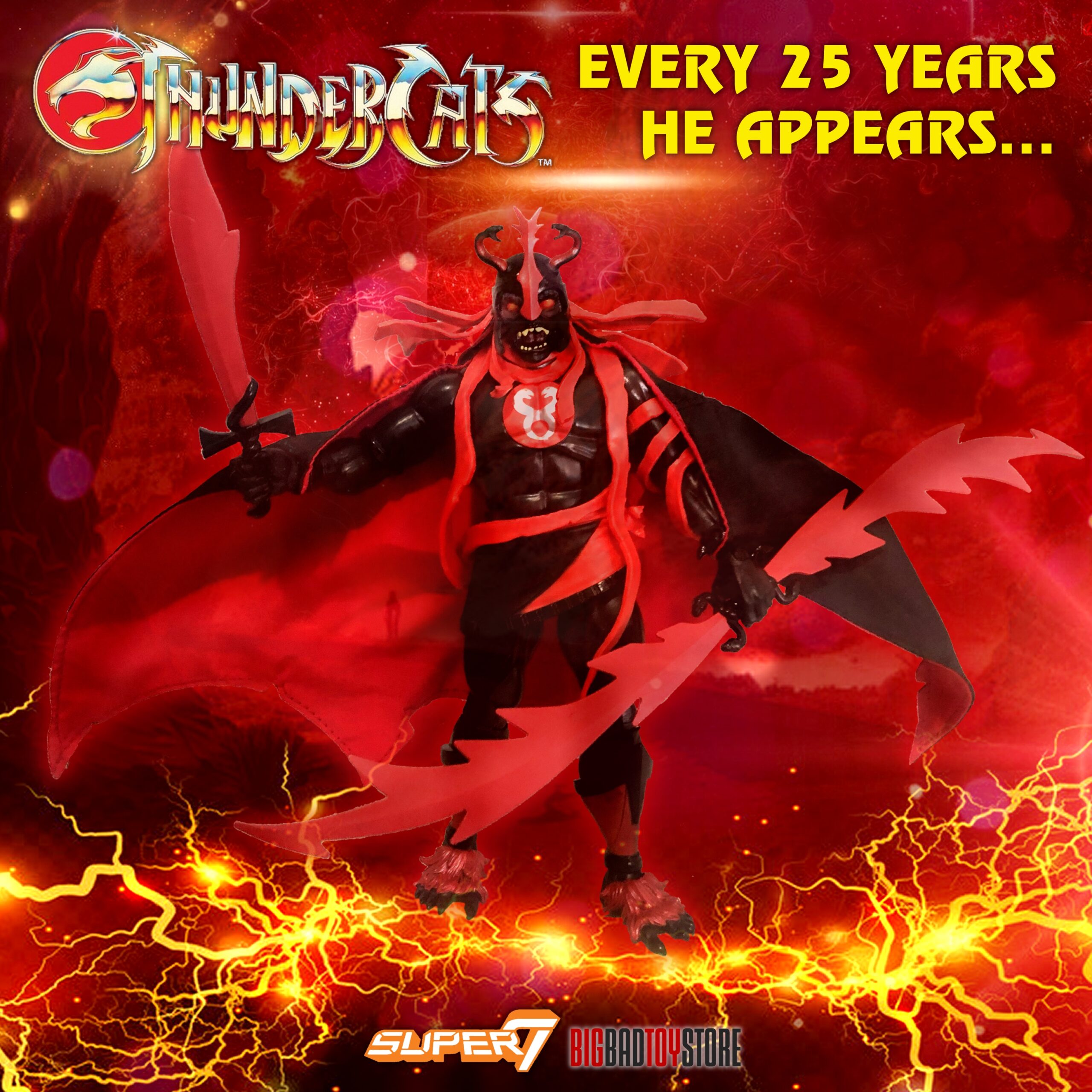
This Mumm-Ra really came out of nowhere. To celebrate Big Bad Toy Store’s 25th birthday, Super7 provided a special variant of Mumm-Ra the Ever-Living in a color scheme that mirrors their logo: black and red. Ironically, the ThunderCats logo itself is also black and red. Coincidence? Perhaps.
The figure went up for preorder mid October and shipped a couple of weeks later. To be honest, while I thought it was a cool idea, it wasn’t a figure that made any special waves for me personally. But that’s the thing about Super7 – they’re always game for something different, and they’ve proven it throughout the years by releasing surprisingly incredible exclusives – from laughing Prince Adam to the Invisible Man…. So this made sense. Still, as a ThunderCats fan I had to have it. It wasn’t anything to get excited about because there is no reference to this version of him in any media. Until now.

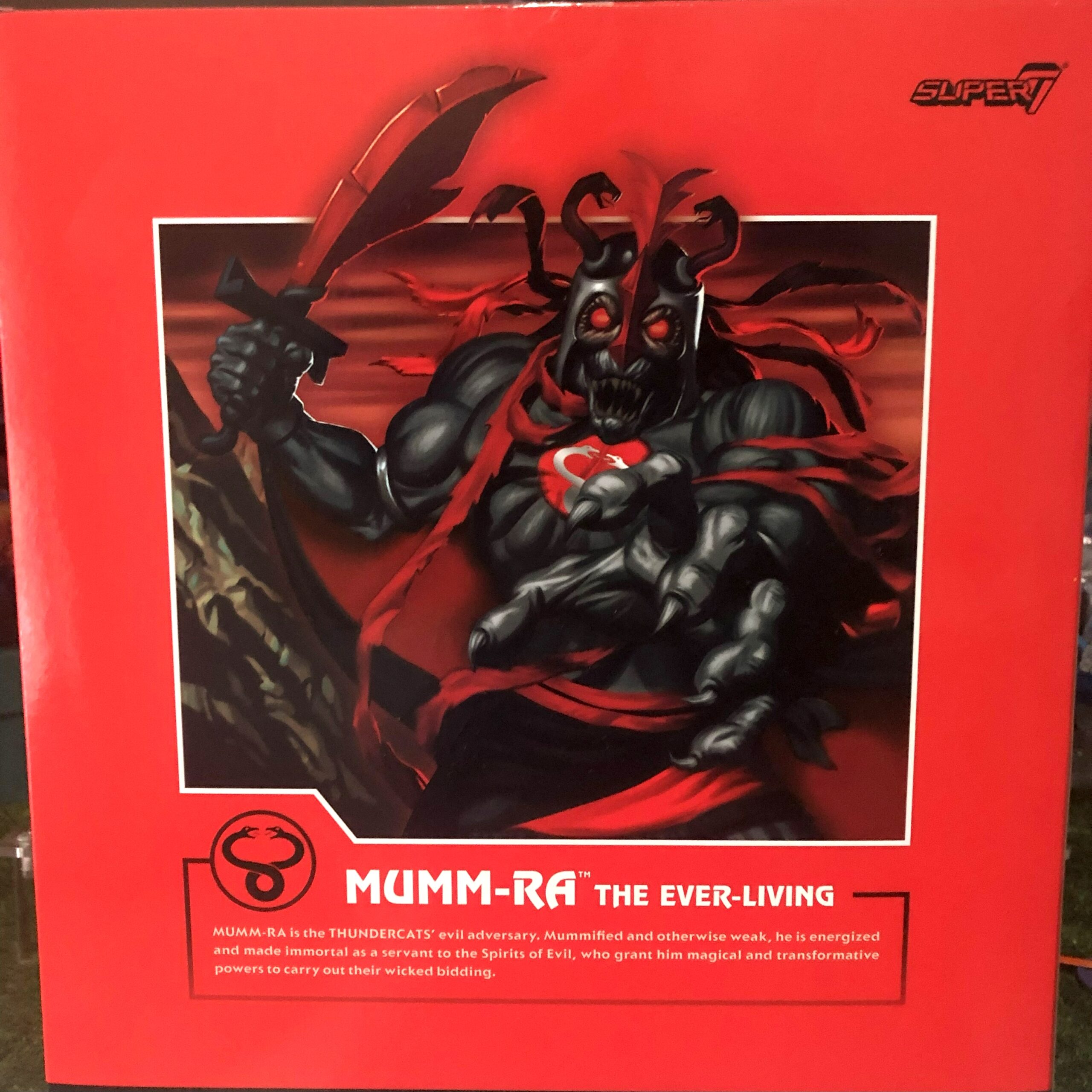
Mumm-Ra came in a bulky box. My biggest wish with this release is that it had Ma-Mutt included in this black and red visage. Maybe one day? It just feels like he could fit in nicely with his master. And the big box certainly had space for him. There was no slipcover here, as is the new norm. The art on the back is the standard art, just black and red. But I have to say, once you hold this big box in your hand you really start appreciating what it really is hiding inside.
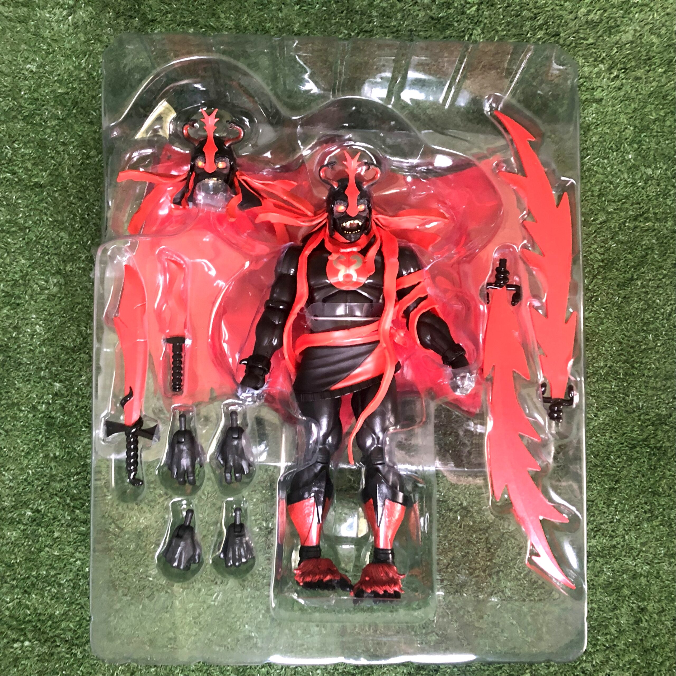
As I said, Super7 knows what they’re doing, and they really struck a nerve here I never knew I had. I never knew I needed Mumm-Ra in this colorway. I am secretly hoping for more characters like this. At least we know BBTS has a birthday every year, so there’s always next year!? This figure really surprised me. I was intrigued. I had to open it up. I wanted to play around with it. This was a new menacing Mumm-Ra – more evil than before. This is fun indeed.
What’s new and different here? Well we are familiar with the two portraits. The paint on them I have to say are exquisite. The eyes look like they’re glowing. Lifelike. The paint is sublime. Even the snakes on his head dress have stunning shading to them. Bravo to the artists who made him. Brava!!!
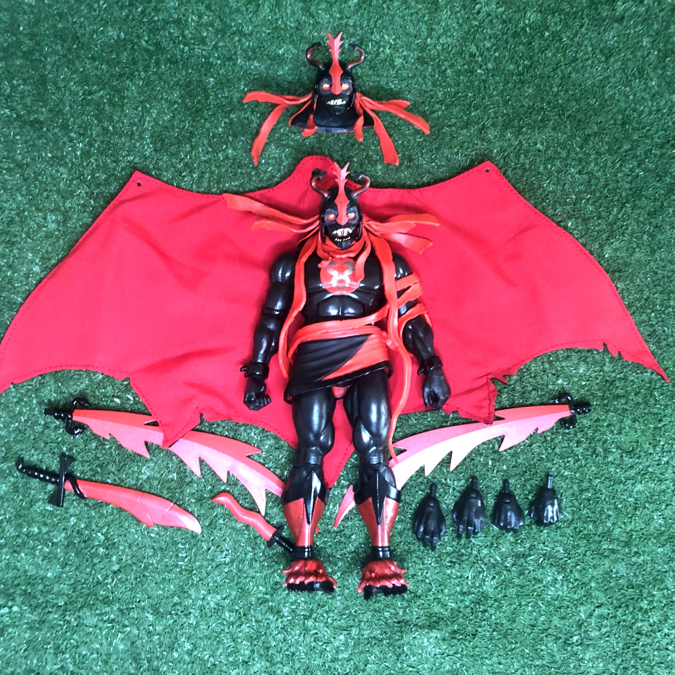
From the neck down you have the toy variant’s buck. It’s evident in the drapings, the silver emblem snake size, and the absence of the peg on the back where one would normally hook the cape on. Only the heads are cartoon “accurate”. The cape is lovely and with its flaws comes an accidental win. It has wiring but not on the edges. It looked weird until I posed him and the way the edges draped so naturally really worked brilliantly. Another happy accident I’d say. To fit the cape, you now peg it over the neck and through the hands, because the removable pegs that the toon version had is glued on tight here just like the toy version.
Weapon wise we have both toon and toy options here – all in the same red and black scheme. This is also the first time we’re able to put together the Sword of Plundarr as it comes packaged in two halves. It’s evident from the first release that this was previously glued together. Now we know.
A lovely feature is the glossy black paint used on the finger and toe nails, the bracelets and several other places. Who knew you got so many different shades of black. Just hold it under the light and be surprised.
I really wasn’t as excited as I’ve been about other figures when this one shipped out to me. But boy did that change the moment I opened him up. I love him in his box but I also love his dangerous presence on my shelf. I just sit and stare at it. Like a black hole sucking me in to a different dimension. And knowing all that, I have to congratulate Super7 – this figure was an excellent surprise. If you for any reason don’t feel attracted to this figure, give it a try. In hand it will blow you away…